Roast Landing Page 🔥
Made by @zaidmukaddam
toss a star :)
note: this is a joke, please don't take it seriously

6/10
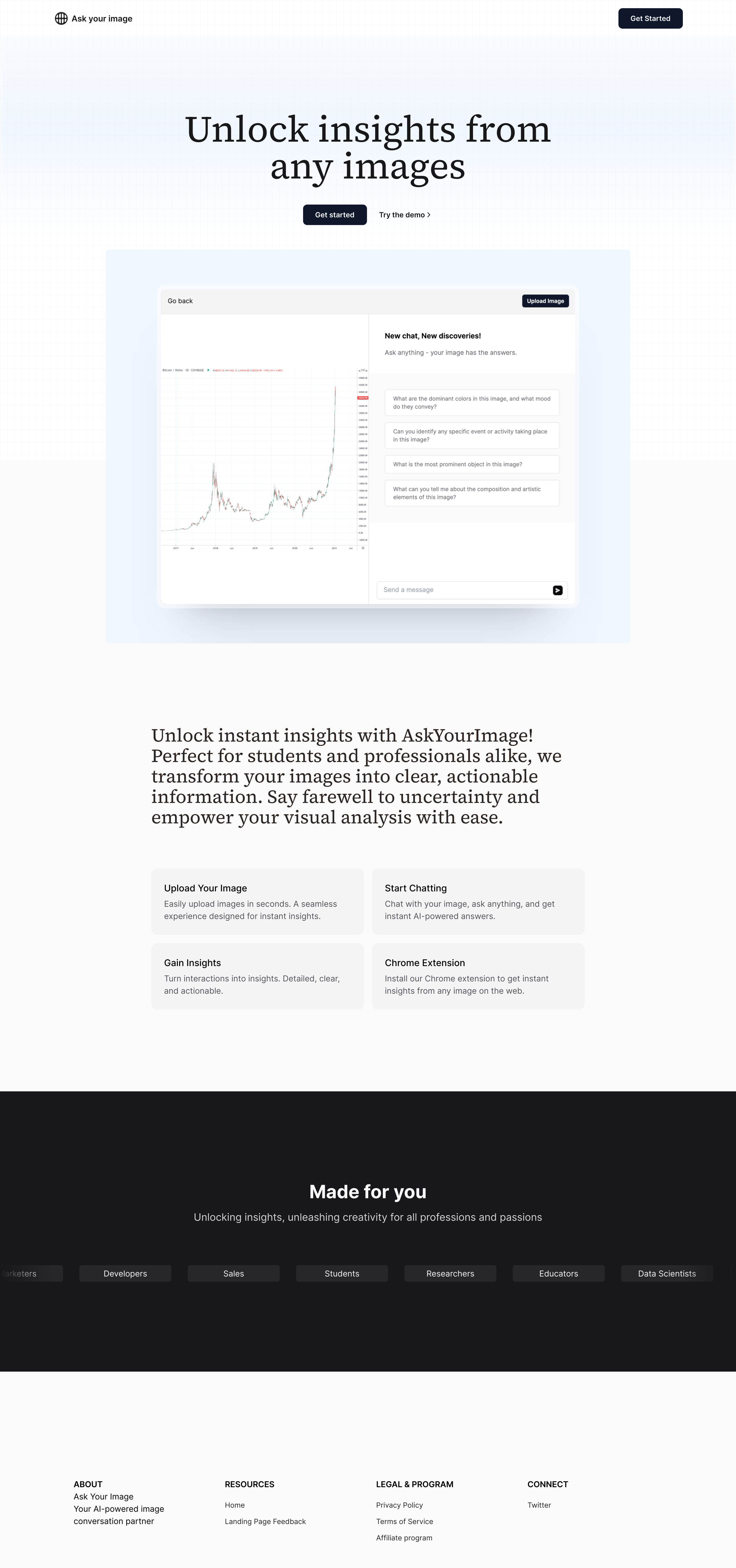
It's as if Helvetica had a baby with a spreadsheet and called it "design."
I've had more exciting experiences watching paint dry. With all the white space, it's a miracle the text doesn't get lonely. How about we add some visuals that actually celebrate the 'unlocking insights from images' instead of just saying it?
Roasted Pointers:
- The color palette is like a diet of water and rice cakes – technically functional but desperately crying out for some flavor.
- That chat interface seems to have taken minimalist inspiration from a ghost town – are tumbleweeds included with every chat?
- The value proposition could use a dash of excitement; it reads like the side effects section of a medication pamphlet.
- The feature icons are about as engaging as a dial tone – they could use a visual pick-me-up to build a connection.
- The “Made for you” section suddenly makes me miss those targeted ads that think I'm interested in Alpaca farming. Can we get some personal touch here?